Two sentences. That was the entire brief for an unreleased AI platform. The task: imagine the product from zero, its vision, its brand, and how it should feel to use.
A top global consulting firm commissioned the full concept for an unreleased AI platform: product, branding, and design. The brief was two sentences describing a problem, handed over by a practice director.
My job was not to decorate a spec. It was to define what the product could be: its long-term direction, its logic, and what it should feel like to use. The engagement ran on and off across several phases, with reviews reaching the firm’s top leadership.
The promise of the product was dense. It surfaces signals, insights, and emerging opportunities that businesses can act on. Underneath it sat a single design question: how do you make that much complexity feel obvious?
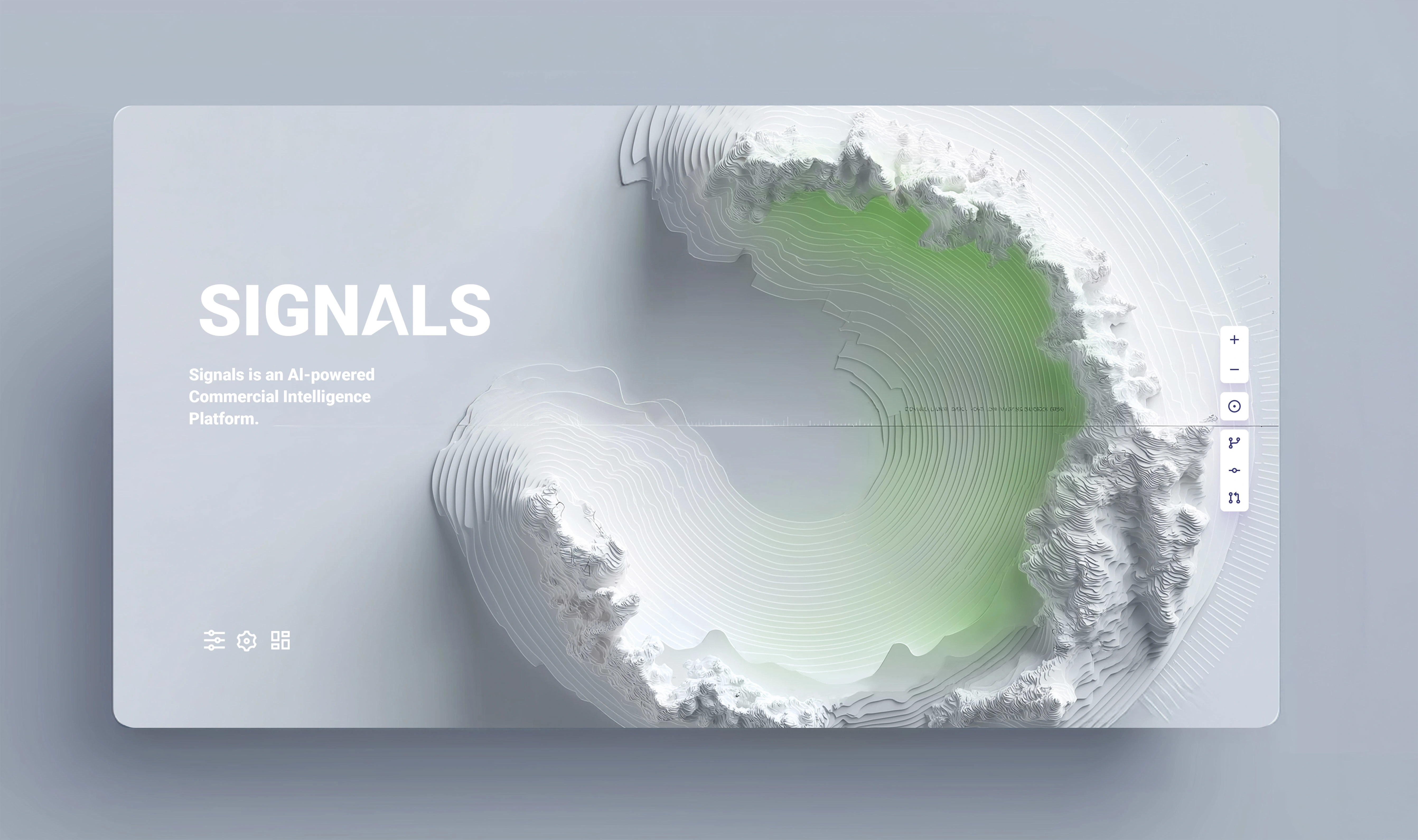
I anchored the entire exploration to two questions. Every direction I designed had to answer them while staying distinct, on brand, and intuitive to use.
How do you bring simplicity to the handling of complex, multidimensional, and highly detailed analysis?
How can the platform help a business see opportunities and stay focused, inspired by the problem instead of overwhelmed by the volume of data it takes to stay factual?
Rather than commit to one interface early, I designed the vision as a spectrum, from familiar analytics to fully organic, living systems. The firm could react to real directions instead of abstract words.
Around the visual language I built what makes it usable: a persona of the firm’s client, the touchpoints that client moves through in the product, how AI shows up and explains itself at every stage, and concepts extending the system to conferences.
Unpacked the two-line brief into the real job: helping people see opportunity in noise. Defined "clarity" as the north-star principle.
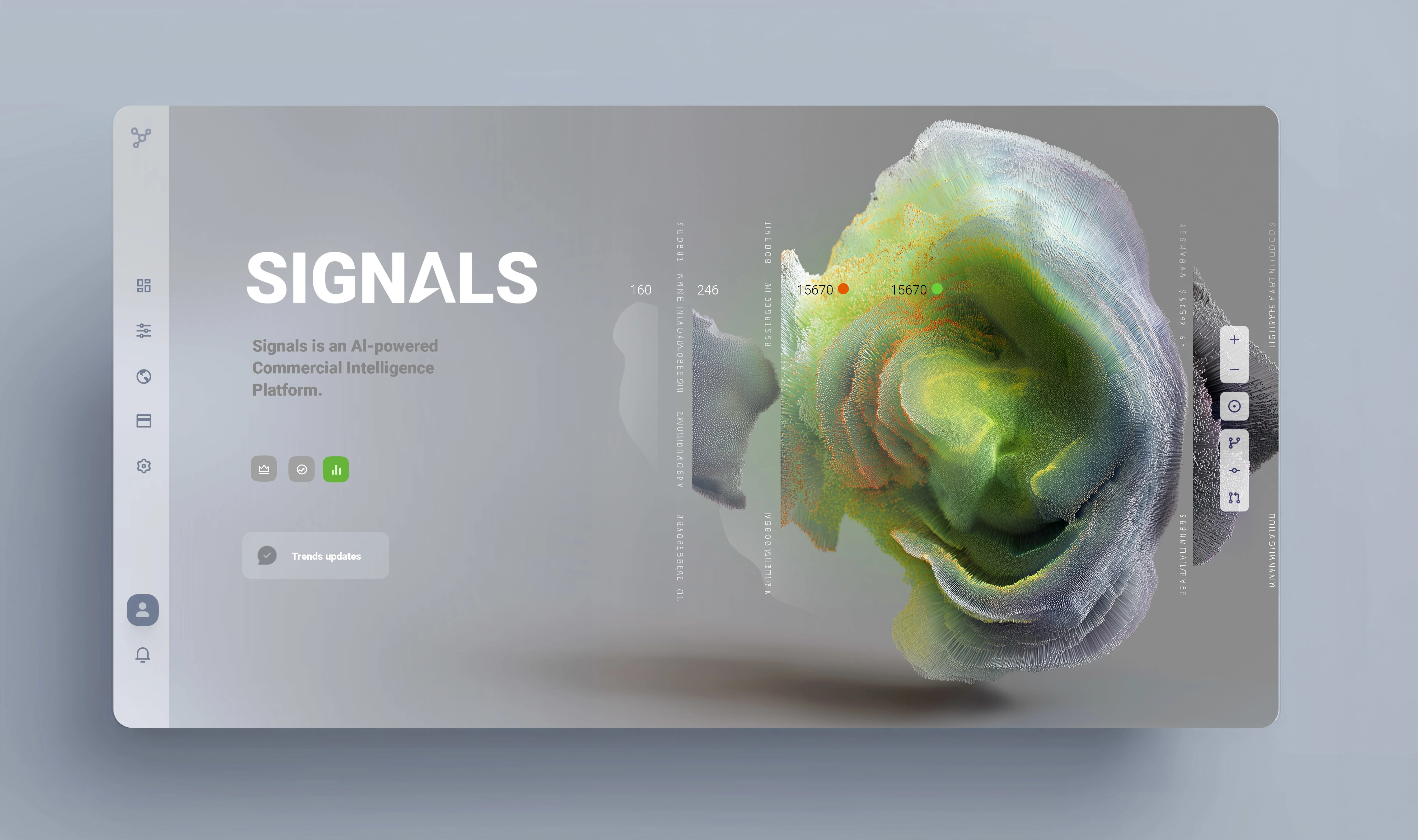
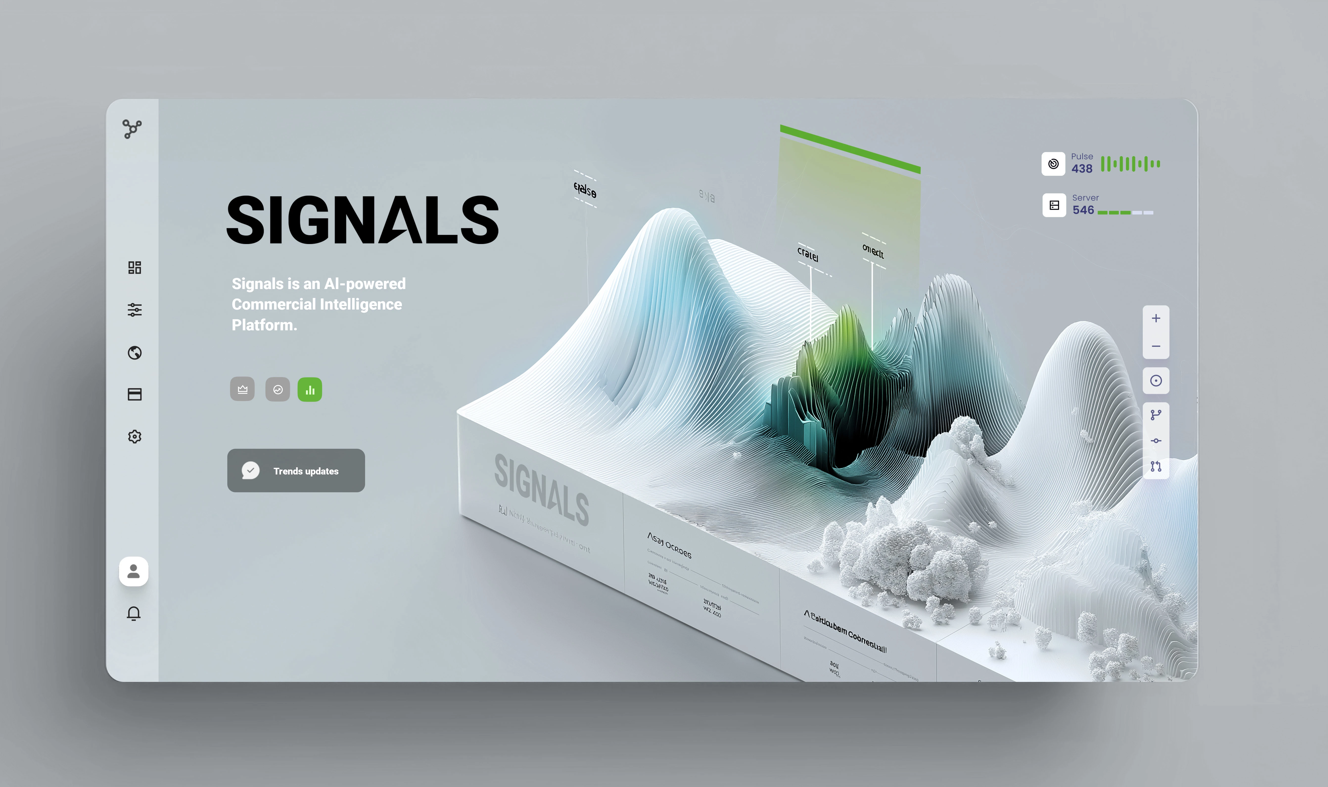
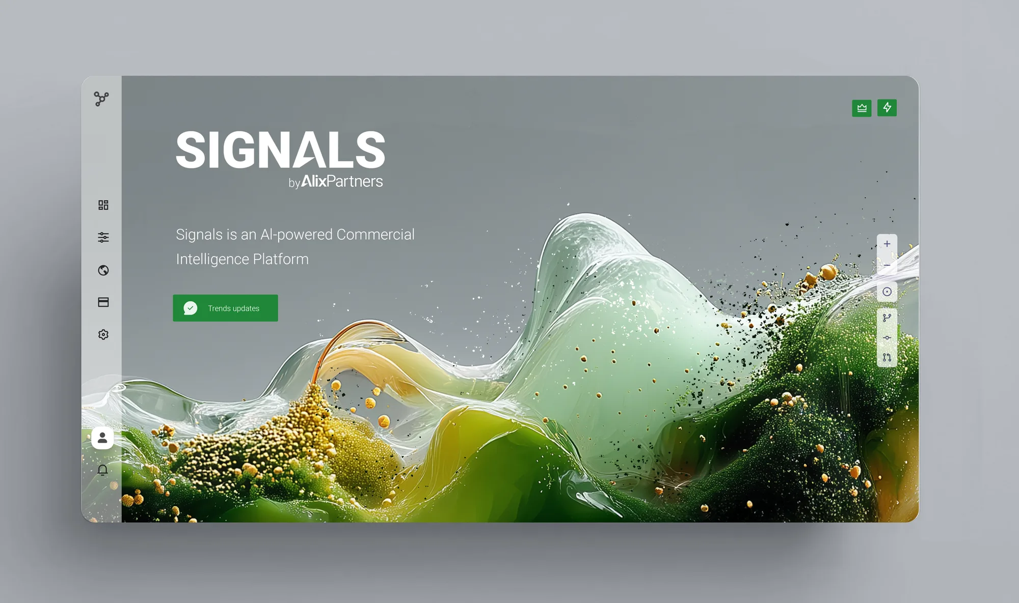
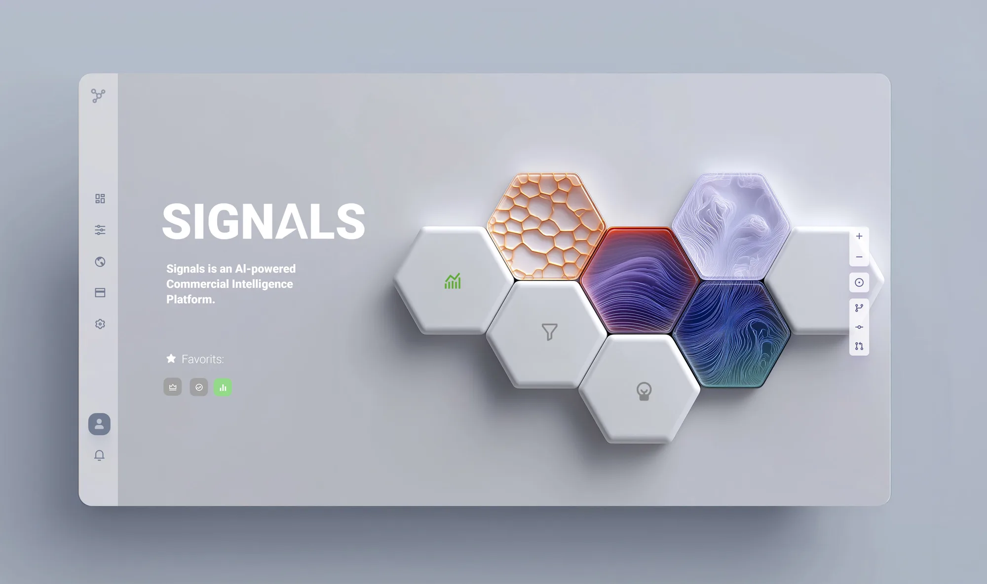
Explored living terrain, a breathing system, a clarity layer, market waves, and a continuation of clarity, each a different answer to "what does an insight look like?"
Presented 11 vision frames. Pressure-tested each direction against the two questions and the client's product ambition to land the one that could scale.
Five visual languages, each treating data as something different: a landscape, an organism, a structure. Shown full screen, one direction at a time. And running through all of them, the sixth: clarity.
The actual vision frames delivered to the client: from early concept directions through interaction patterns, material language, and insight-flow systems.
The firm accepted the work in full. The feedback that came back through leadership was that they loved everything. Then it sold a second time: during an iteration review, one of the firm’s clients bought that iteration outright, together with the complete branding. The firm kept the rest of the system and continues developing the tool on it today.
When the brief is two sentences, the job is to define the product, not just draw it. Naming clarity as the principle gave every design decision a test to pass, and gave the client a language to choose with. Showing a spectrum of directions instead of defending a single one turned the review into a conversation about ambition rather than taste.
Most of all: a vision only matters if someone can build on it. The strongest signal here was not applause. It was the firm’s client buying an iteration mid-review, and the firm continuing to build the tool on the rest.